
Fun with Images
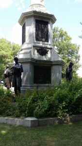
I have been moving between research that is reading and research that is visual. I’ve found several images of the Worth Memorial location which show the site in such a way that you can compare that historical reference to its current state. This is fascinating to me because it so clearly shows how the city has changed.
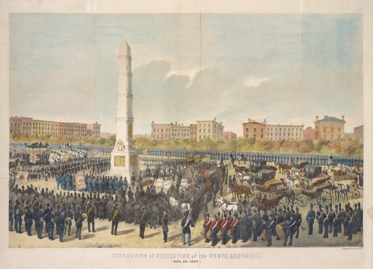
When the memorial was originally constructed, it dominated the landscape. This can be seen clearly in the lithograph below, which shows its 1857 dedication ceremony. Any buildings are far away, as the intersections between Broadway and Fifth Avenue merged at its base and the cobbled stone roadways were wide and deep, with Madison Park seemingly far in the distance.
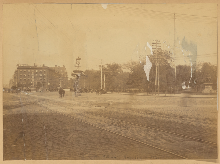
Some thirty years later, not much had changed. The area is still dominated by wide cobblestone streets, but now there are the metal tracks for the trolly lines, electric lines for arc lighting, and a posh hotel, build across from the monument itself.
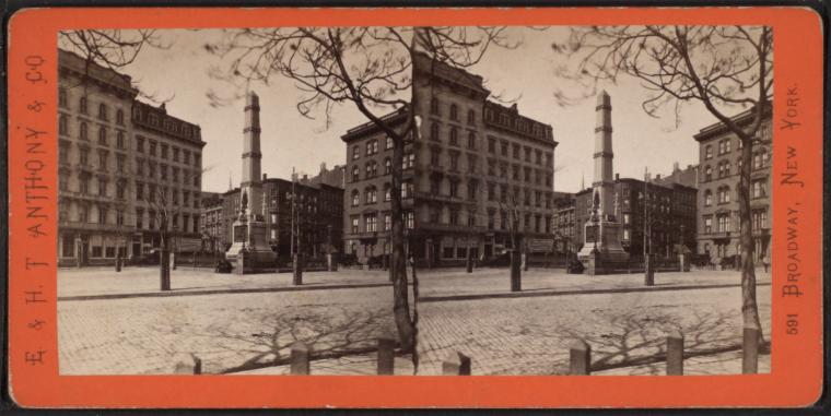
However, by 1930 (the likely date of the stereograph below) Broadway had been narrowed and buildings constructed, hemming the monument in.
Over time, the buildings have only grown in height until they dwarf Worth’s resting place. In the comparison below, you can see the 1930 view and the 2021 view, side-by-side, at almost the same angle. Without the sky, the monument is absorbed by the streetscape.
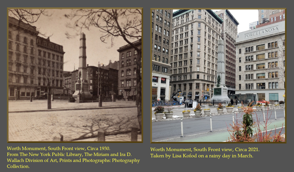
These images are metaphors for the man’s memory. At his death, his memorial dominated the scene. But now, subsumed by the street-scape, it disappears from our view. And yet, it is still there if you have a mind to see it.
[This entry was originally posted to DHUM 70002 Digital Humanities: Methods and Practices (Spring 2021) in Personal Blogs and tagged mapping cemeteries, Personal Blog on April 13, 2021.]

This entry is licensed under a Creative Commons Attribution-NonCommercial-ShareAlike 4.0 International license.


